
Iconic 70s Funk & Soul Record Label Logos
The Vibe in Sight section came to life while I was studying Graphic Design — and deepening my obsession with the 1970s. As I started looking more closely at album covers, posters, and the people behind them, something became clear: there was more to the visual story of the era than the cover art.
Album cover art was a top marketing tool then; we all have books on excellent album covers or have at least browsed them. However, as we look deep, another graphic element keeps appearing again and again: the label logo.
In the early 1970s, music explodes in all directions—deep funk, psychedelic soul, jazz-fusion, early disco. And I assume the smallest (or largest?) detail on the record—the label—must have often been the quickest clue about what waited in the grooves.
Beyond the flat surface of the sleeve, these logos live in a world of circular physics; they are branding elements designed to hold their visual integrity—or even transform—while spinning at 33 or 45 RPM. Before playlists and algorithms, the logo isn’t decoration. It is a signal. Clean typography hints at polish. Hand-drawn forms generally suggest something raw or experimental. These logos are visual agreements between the label and listener—telling where the music comes from and how it might feel and sound.
They also tell another story: control. As artists like Curtis Mayfield and James Brown build their own labels, logos become statements of independence. Not just branding but identity!
I have made a list of some of my favorite label logos. This selection is purely from a design perspective. I have omitted some historically major labels because their logos didn’t speak to me for this story. I begin, however, with a giant—well, because visually, it earns its place.
Stax
Founded—originally as Satellite Records—in Memphis in 1957, Stax is the home of Southern soul and funk. The name—formed from founders' names Jim Stewart and Estelle Axton—already hints at something personal, not corporate.
By the early 70s, funk flows naturally through the Stax catalog—with Isaac Hayes bringing drama, orchestration, and confidence; the Bar-Kays delivering street-level funk; and the Soul Children and Albert King pushing groove into new territory.
And then there’s the logo. The finger snap is one of the smartest label marks of the decade. Rhythm, timing, and feel—all captured in a single, intellectual gesture. The typography is bold, upright, and grounded. Nothing fancy. Nothing abstract. Just confidence. That snap still means something today: we see it, and we expect a groove!


Atlantic
If Stax is character, Atlantic is control and balance. Atlantic’s 70s logo is a lesson in modernist sans-serif precision. The circular “A” is geometric, acting as a visual anchor for the label's wide output. The angular swirl suggests motion. The typography is refined. Even the color variations across pressings feel intentional and bold.
Founded in 1947 in New York by Ahmet Ertegun and Herb Abramson, Atlantic builds its reputation on jazz and R&B before becoming a soul powerhouse. Ray Charles helps define its direction early on, and by the 70s—under the Warner umbrella—Atlantic expands without losing focus. Funk and groove then come through artists like Aretha Franklin in her heavier, rhythm-driven period, Average White Band’s refined sound, and the brief but important connection to The Meters.
The logo fits the sound perfectly: polished, confident, and adaptable.
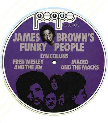
People Records
James Brown launches People Records in 1971—and being nice isn't the goal for sure! It is about control—of sound, of output, of direction.
The logo says it all: rounded, lowercase, heavy-weight, and tight-spacing—it is almost stubborn in its simplicity. No decoration, just street-level attitude—but still friendly... People Records becomes the most direct channel into early-70s James Brown funk: stripped-down arrangements, relentless rhythms, and horns locked into repetition.
This is where Lyn Collins, Bobby Byrd, and the J.B.’s deliver their fiercest work. Visually, the label doesn't try to compete with psychedelic or design-heavy imprints. Everything points back to the music. We see the logo = we expect funk.

Curtom
Curtom, founded in Chicago in 1968 by Curtis Mayfield and Eddie Thomas, offers an entirely different visual tone. The logo leans into fluid display type—inspired by a psychedelic, Art Nouveau flow—with soft edges, movement, and warmth. It feels human and intentional, not rigid. A perfect match for Mayfield’s expansive musical vision.
Curtom houses some of the richest soul-funk of the decade: Curtis Mayfield with the legendary soundtracks Super Fly and Roots; the lineup of The Impressions, The Five Stairsteps, and Baby Huey. Strings, groove, emotion—all carefully balanced.
Sussex
Sussex looks like confidence—and its name tells us exactly where that confidence comes from.
Founded in 1969 by Clarence Avant, the name is a cheeky blend of “Success” and “Sex.” Visually, the label embodies a study of heavy, rounded geometry. The logo features a modular, triple-banded ‘S’ that looks like a neon tube or a high-speed race track—a perfect symbol for such a label. The typography for the word "Sussex" is equally iconic: a bold, "fat" typeface with rounded terminals that feels very 70s Pop Art. The use of negative space and bold, clean lines means the label doesn't need to shout; the design relies on the strength of a solid, soulful foundation.
Sussex serves as a hub for a diverse range of musical genres, with funk, soul, folk, spoken word, and experimental grooves coexisting harmoniously—from Bill Withers to Dennis Coffey.


Westbound Records
Westbound looks exactly like it sounds.
Founded in Detroit in 1968 by Armen Boladian, the label embraces the raw, psychedelic edge of funk. The logo is wavy, stacked, and slightly out of the real world—as if vibrating!
Westbound is forever tied to Funkadelic’s early run (Maggot Brain, Cosmic Slop), but the roster goes deeper: early Ohio Players, Detroit Emeralds, CJ & Co.
Westbound is funk with typographic distortion, attitude, and chaos—a perfect blend.
Philadelphia International Records
PIR is the definition of 70s luxury groove—if there is such a thing!
Founded in 1971 by Kenneth Gamble and Leon Huff, the label is the "perfected orchestral funk and soul." Polished, ambitious, and built to last.
The logo mirrors that precision: a stylized “P,” a vinyl-like circle, and clean vertical lines. It is a sophisticated example of branding. Behind the polish is a serious groove: MFSB’s rhythm section powering everything, especially "TSOP." And the O’Jays, Teddy Pendergrass, Billy Paul, and Lou Rawls—all delivering music that balances elegance with pulse.


Salsoul Records
Founded in New York in 1974 by the Cayre brothers, the label is known to merge Latin rhythm, soul, and disco into a single, high-energy language. Even the name—salsa + soul—tells the whole story.
The Salsoul logo, designed by Johnny Crespo, might be the most joyous in the entire list. Its hand-drawn, rainbow-gradient typography and soft cloud backdrop shout color, energy, and movement. This visual identity mirrors a fascinating evolution: Salsoul’s palette shifts from the earthy, naturalistic tones of early-70s Latin soul (like the street-level photography of Joe Bataan) to the vibrant, neon-adjacent colors of the disco explosion. One can literally see the sound change from the grit to the glitter.
The music matches that action: The Salsoul Orchestra, Double Exposure, and the powerful vocals of Loleatta Holloway. By pioneering the 12-inch single format, Salsoul gives these vibrant designs a larger canvas, defining the look and feel of the late-70s club scene.
Strata-East
If any 70s label looks and feels like pure creative freedom, it’s Strata-East!
Founded in 1971 by trumpet player Charles Tolliver and pianist Stanley Cowell, the label is the home for forward-thinking jazz musicians who wanted full control over their sound, their sessions, and their visual identity. The label is built on collective ownership, focusing on politically aware, uncompromising music. And because the musicians are in charge, the records both sound and look independent. That independence is visible immediately through its clever use of negative space and minimalist, sunburst-like geometry.
Strata-East is the home for groundbreaking, serious-minded groove music, a who’s-who of 70s boundary-pushers: Pharoah Sanders, Gil Scott-Heron & Brian Jackson (early on), Clifford Jordan, Mtume, Billy Harper, and more—all feeding into the label’s signature blend of spiritual jazz, modal grooves, and long-form improvisation.


Fania Records
If the 1970s had a single label that looked as festive, electric, and street-level vibrant as the music it released, it would be Fania Records!
Founded in New York by Johnny Pacheco and Jerry Masucci, the label is the center of Latin soul and salsa’s global explosion.
The Fania logo is "motion in typographic form." Elongated, angular letters stretch upward like dancers—a graphic expression of the music’s energy. Whether it is printed in neon colors or simple black and white, the logo communicates movement.
The 70s are Fania’s peak: Celia Cruz, Willie Colón, Héctor Lavoe, Ray Barretto, and Rubén Blades are all part of Fania All-Stars as well. The logo matches this wonderful sound—colorful and alive.
Vertigo
And then there’s the swirl. Vertigo’s legendary black-and-white spiral is one of the most hypnotic logos in record-label history—just like a vortex that pulls us straight into the music.
Founded in 1969 under the Philips/Phonogram umbrella, the label is all about experimentation—progressive rock, jazz-rock, fusion, heavy groove.
The brand is conceptual and challenges the mainstream, with Optical Art movement of the era heavily influencing it. The iconic 'Vertigo Swirl' logo, created by Roger Dean, covers the entire A-side label of its album releases and is often cited as being visually reminiscent of the famous opening titles designed by Saul Bass for the 1958 Alfred Hitchcock film, Vertigo.
The design succeeds through its deceptive simplicity: stark geometric contrast and a centered placement that transforms the spinning LP into a piece of kinetic art. Even when static, that inner swirl suggests a sense of movement that mirrors the label’s experimental sound.
While not a funk label in the traditional sense, Vertigo’s roster includes essential jazz-rock and funk-fusion acts like Colosseum and Assagai, whose recordings are defined by complex, high-energy, and often funky rhythmic structures.

Taken together, these labels show that groove history isn’t just about sound—it’s also about how that sound looked, felt, and presented itself on vinyl. From the snap of Stax to the swirl of Vertigo, from the raw focus of People to the color and movement of Fania and Salsoul, each label would build a visual identity that functioned as a lighthouse for the listener.
The logos are signals—telling us what to expect! And decades later, they still speak clearly to us—the collectors, designers, and music lovers—as we know that funk history lives as much in the design as it does in the sound.
Gülben - 12/2025
.png)